Page History
...
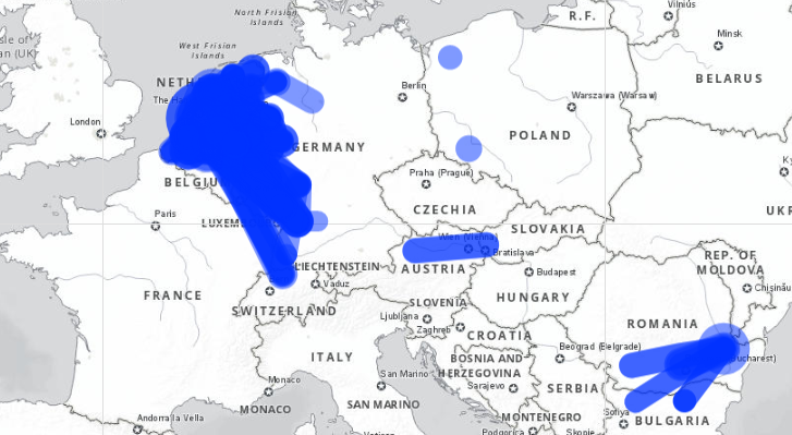
The screenshot below shows all flows above 500,000 tonnes in 2018 (unlike the rail data, the inland water data are collected annually). View this map at https://rpubs.com/BlackburnStat/690029.
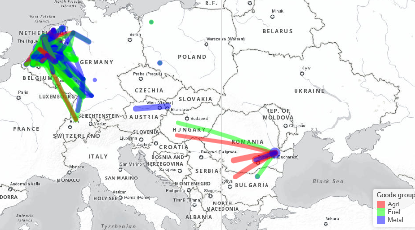
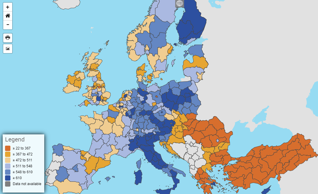
NST2007 has too many categories to easily visualize, but it is possible to combine a few different categories. The below map compares three broad good types: "Agri" contains, agricultural products, forestry products and food; "Fuel" contains primary and secondary fossil fuels; and "Metal" contains primary and secondary metallic products, as well as chemicals. This map is available at https://rpubs.com/BlackburnStat/690030.
Road
Road freight
...
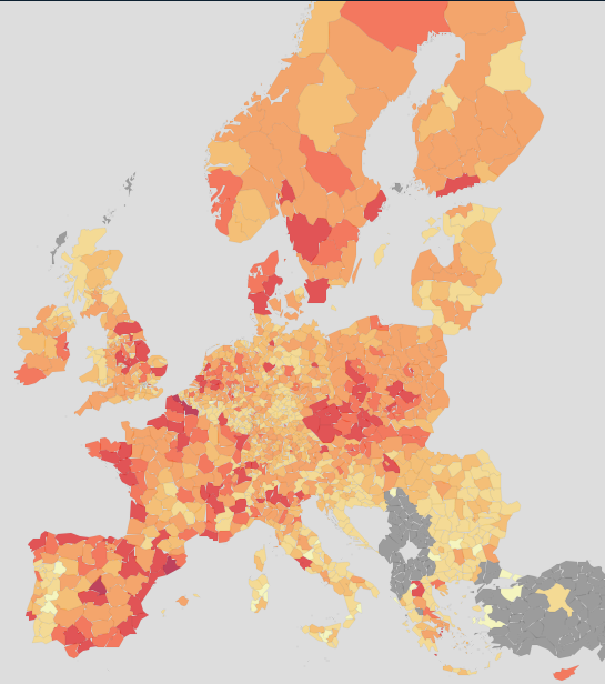
Data availability is essentially complete for EU and EFTA countries. The below map shows region of loading, coloured by loaded quantity. The interpretation of the visualisation is somewhat complex; while on the one hand the darker areas represent areas with more goods loaded and therefore more commerce and industry, there are also highly industrialised areas (e.g. along the Rhine) with low values due to the favorising of inland water transport and rail.
...
Other road data
Unfortunately no regional road passenger data are currently collected.
Road vehicle fleet
Passenger The number of passenger cars per thousand inhabitants is an interesting of how much cars are used in different regions compared to public transport, although it is also is related to income as well. These data can be visualised on the Eurostat website directly here https://ec.europa.eu/eurostat/databrowser/view/TRAN_R_VEHST__custom_250445/default/map?lang=en.
...
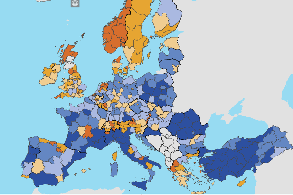
Road accidents per million inhabitants by region can be plotted in a similar way. There is an important disclaimer to note, which is that this will likely overrepresent the road danger in some sparsely populsted regions that have principal roads passing through them. The below image is sourced directly from Eurostat's data browser https://ec.europa.eu/eurostat/databrowser/view/tran_r_acci/default/table?lang=en.
Modal Split Analysis for Specific Corridors
...
Transforming Straight Lines
...
onto the Real Network
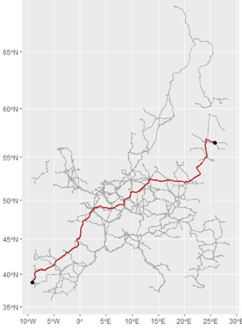
In the origin-destination visualisations above, connecting lines are based on the centroids of the origin and destination regions. At the aggregate level this provides a reasonable level of accuracy for the visualisation, but it would obviously be better if the route fitted the real pattern of the network instead. How can this be done?
The first step is to obtain the relevant network Shapefiles. Through its various infrastructure agreements, UNECE has Shapefiles for the AGN (inland waterways) and AGR (road) agreements. Shapefiles for the AGC (railways) agreement are not yet available, but the TEN-T core rail network files are available and this closely agrees with
with the AGC network.
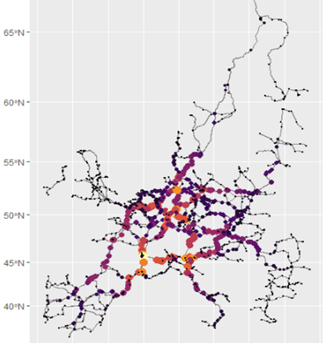
The problem, however, is that a Shapefile is a collection of line features, which is not a network in the mathematical sense of a graph with nodes (or vertices) and edges (or links): line features do not know what they are connected to, nut network elements do. In order to transform the graphic into a fully-fledged network, the sf library can be used (described clearly in this step-by-step R-spatial blogpost.) This method has the advantage of being able to transfer data from a geospatial data structure to a simple data frame structure and back again, in a single command, which makes manipulating the output very straightforward.
Running the sf code on the AGC network works well. The below left graph shows the "betweenness" of each node; thus the yellow and orange nodes are the ones most connected to the rest of the network. In order to test to se if this network
Country Examples
...
Overview
Content Tools
Apps